
CHEF iQ Sense Redesign
"When an experience is meant to guide, even small frictions can erode confidence."
Overview
The Chef iQ Thermometer is a smart cooking tool designed to help home cooks achieve better results with confidence. I led a redesign of the thermometer experience based on years of accumulated user feedback, focusing on reducing friction across setup, control, and active cooking. Rather than fixing a single broken feature, the goal was to rebuild the experience from the ground up and turn a functional product into a more cohesive and reliable one.
My Role
I led the thermometer redesign, owning the core experience across setup, manual and preset configuration, and active cooking. I partnered closely with design, engineering, product, and culinary to shape a more cohesive and intuitive end-to-end experience within the app.
The Problem
The thermometer worked, but the experience felt heavier than it should have. Small points of friction across setup and cooking added up, making it harder for users to move through the experience with confidence.
Simple tasks often took more effort than expected, and the information didn’t always match what users were actually looking for in the moment. Nothing was outright broken, but together these issues made the experience feel less intuitive than a product meant to guide should.
User Feedback
“Too many steps just to check the temperature.”
“I just want to see the temp, not manage the whole cook.”
Across reviews, the pattern was consistent. Users were not struggling because the thermometer lacked capability. They were struggling because the experience made simple things feel more complicated than they should.
Setup felt overly involved, especially when managing multiple probes. Users had to go through unnecessary steps just to get to a basic cooking state. Once cooking, many found themselves searching for the information they actually cared about, primarily temperature, while the experience emphasized other details or required additional navigation to access it.
At the same time, more advanced users expressed a desire for control. They preferred using the thermometer manually, setting and monitoring temperature directly, rather than being guided through structured flows or presets.
The common thread was not missing features. It was a mismatch between what the product emphasized and what users actually needed in the moment.
Design Challenge
How might we address a wide range of user feedback and introduce more capability, without adding complexity or making the experience feel heavier?
Design Goals
Support setting up multiple cooks in a single, streamlined flow.
Make cook setup clearer, faster, and more flexible.
Make it easier to understand each cook by exposing individual sensor data within a probe.
Make active cooking easier to understand at a glance.
Provide more useful and actionable information on the appliance overview.
Create a cohesive experience across all touchpoints.
Key Design Decisions
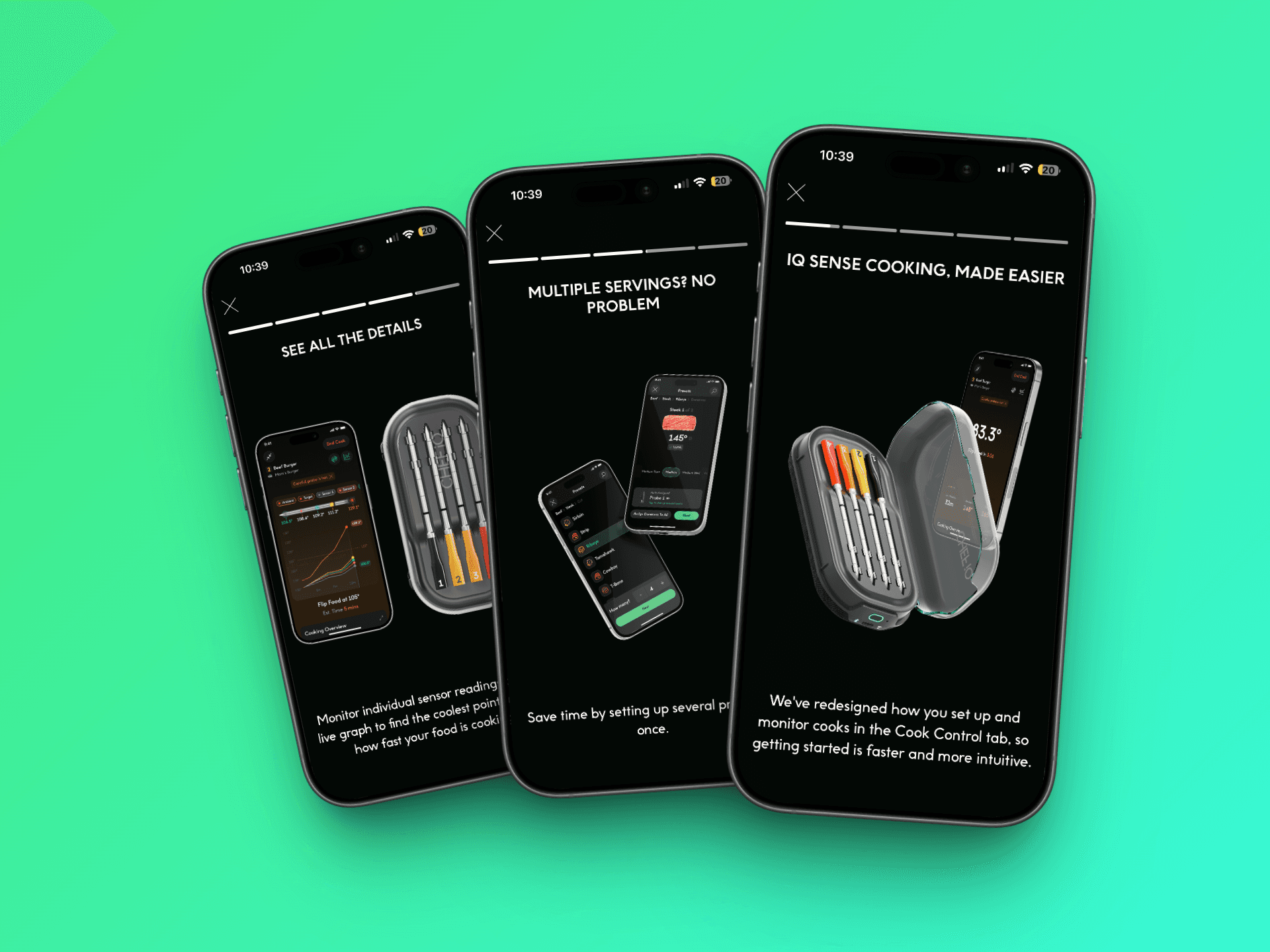
Multiple Ingredient Setup
Enabled configuring multiple probes in a single flow instead of setting each one individually.
Simplified Manual Setup
Made Manual setup clearer and more direct, focused on quickly setting and monitoring temperature.
Faster Preset Selection
Added quick picks to surface recent and popular cooks, reducing time spent navigating.
Clearer Setup Through Visuals
Introduced visual elements like the probe-based thickness selector to make decisions more intuitive.
Functional Appliance Overview
Transformed the overview into a place where users can monitor and control cooks without navigating deeper.
Focused Active Cooking
Prioritized internal temperature, upcoming steps, and clearer data visualization to make cooks easier to follow.
Product Thinking
The challenge wasn’t adding new features, but integrating them without increasing complexity. Many of the improvements, such as multi-cook setup, deeper sensor visibility, and expanded overview functionality, introduced more capability into the system. The focus was on ensuring these additions made the experience feel lighter, not heavier.
A key shift was aligning the experience with how users actually cook. Rather than treating setup, cooking, and monitoring as separate flows, the redesign aimed to make them feel connected and consistent. Decisions around information hierarchy, especially prioritizing temperature, and making key actions accessible from multiple points in the experience, helped reduce friction and build trust throughout the entire cooking process.
Outcome
The redesign shipped as a full update to the thermometer experience across setup and active cooking.
Early feedback has been mixed. Some users responded positively to the improvements in clarity, speed, and flexibility, while others needed time to adjust due to changes in familiar flows and muscle memory.
As with most redesigns, there is an adjustment period. We are continuing to monitor user feedback and behavior to understand how the experience performs over time.
Reflections
If I could revisit one part of the process, I would invest more in user testing earlier on. While the redesign was grounded in existing feedback, validating key decisions through direct user interaction would have helped de-risk some of the changes, especially around established behaviors.
One open question is how to better introduce changes to users without disrupting their existing mental models. The redesign improved the experience structurally, but it also required users to relearn certain flows. Balancing meaningful improvement with familiarity is something I would continue to explore.
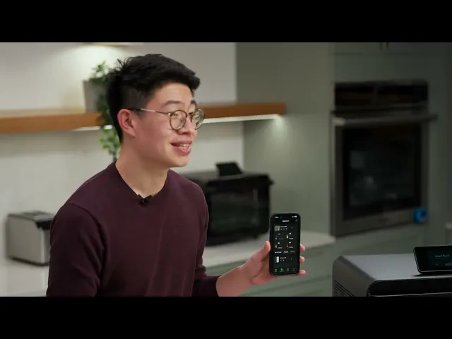
You can see a walkthrough of the redesigned experience in the February product update below.